
By Caroline Evans
As a front end developer with a graphic design background, I appreciate good typography. It can mean the difference between readers fully embracing your message or disengaging entirely. Here are some quick tips to level up your typography game, whether you’re creating a PowerPoint presentation or creating a landing page for a website.
1. Keep legibility and readability in mind
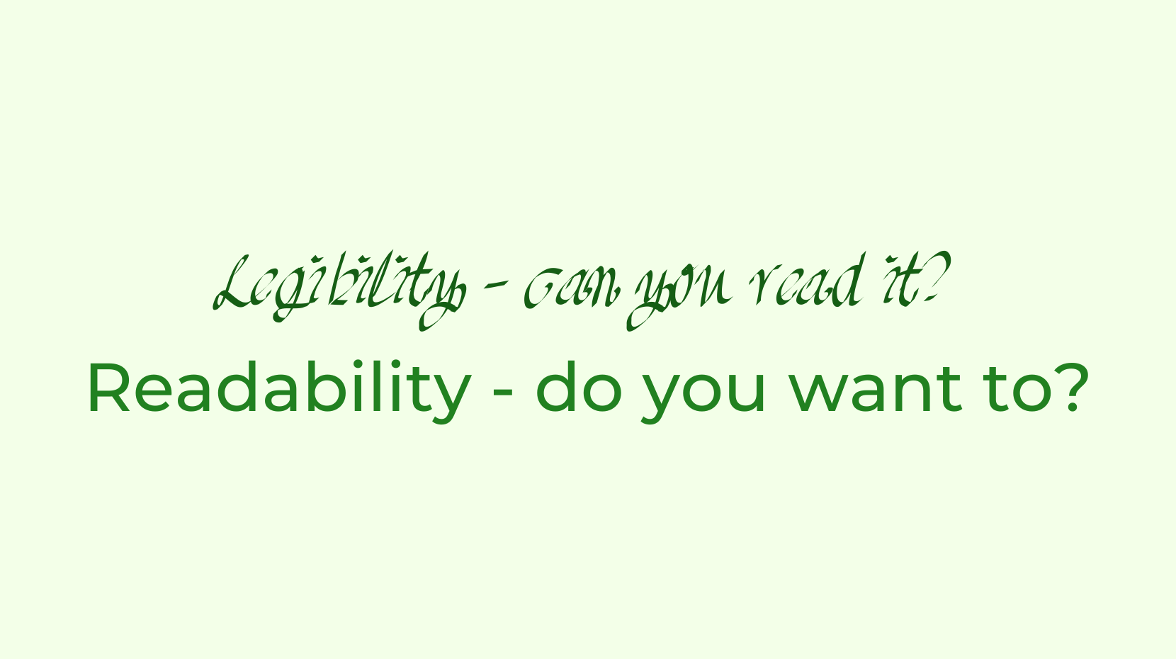
When working with text, the goal is to create something that is both readable and legible. These two terms are easily confused.
Legibility means that text can be interpreted, but that’s like saying tree bark is edible. – On Web Typography, Jason Santa Maria
Think of the old text-based recaptchas. It should be noted as well that these weren’t even legible for everyone, which is a big reason why they were phased out.
Legibility is the bare minimum, whereas readability is about creating a pleasant reading experience. Keep reading for tips to help with readabiilty.
2. Choose your typefaces wisely

When selecting fonts you want to keep it simple. If you’re working with a lot of text, a solid body copy typeface is a great place to start. Choose something with a low to medium level of contrast. Contrast here refers to the difference in width from the thinnest to the thickest parts of the letterforms. Anything with a high level of contrast (Bodoni is a good example) is too distracting for body copy, as our eyes are drawn to the exceptions. You will also want your body copy typeface to have a large family of fonts, with lots of weights with italics. It should also support numbers, correct punctuation, and any special characters you might need, for example if you need to support multiple languages.
Optionally, you may like to pick a secondary, decorative typeface that pairs well with your body copy and matches the subject matter or tone of the content. This way you can be expressive without detracting from readability.
3. Create a sense of hierarchy
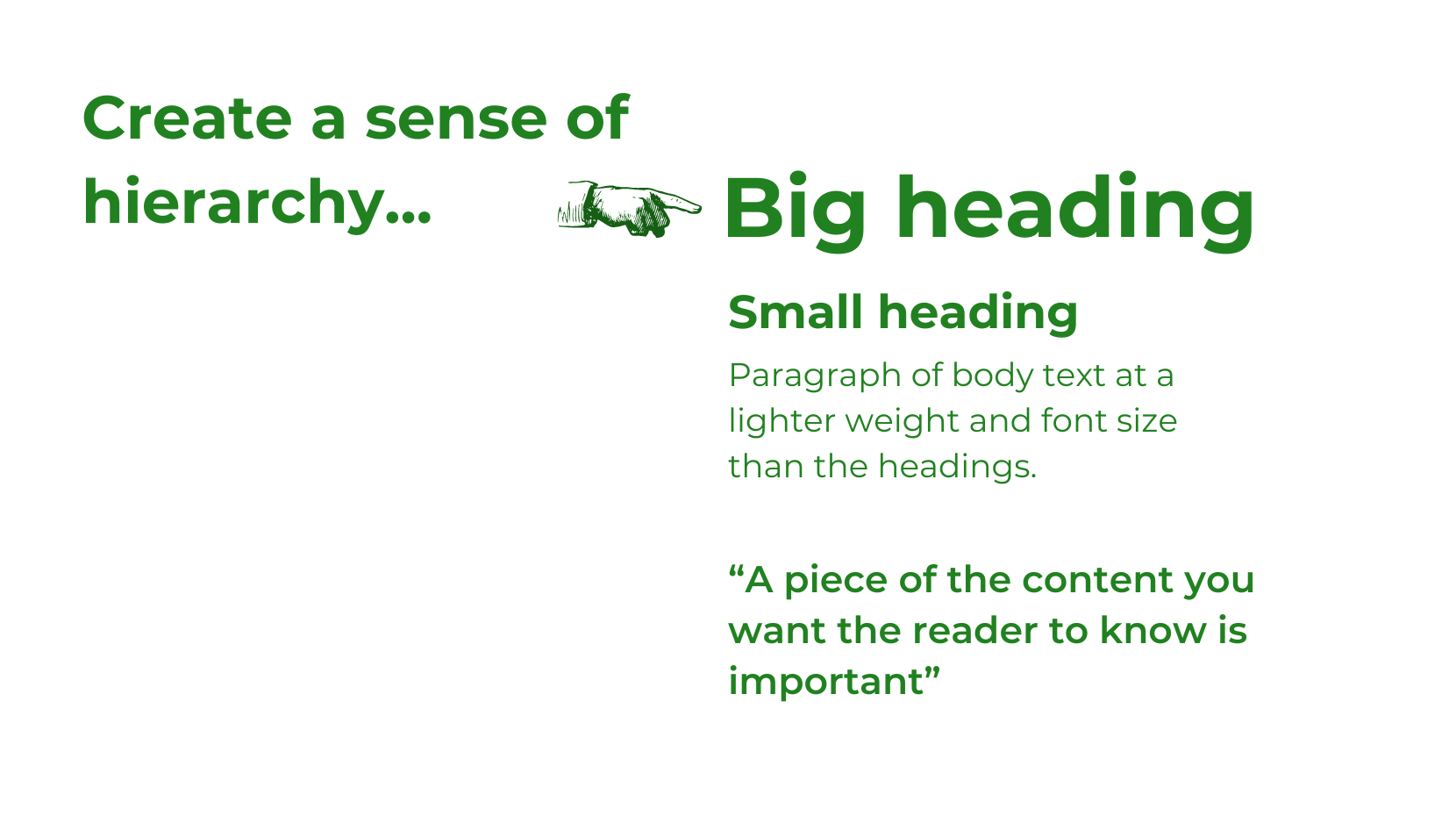
Hierarchy is important. It helps readers scan the page to get a sense of what they’re looking at and navigate through the text if they do chose to read it. Visual hierarchy should reflect the hierarchy of the content. Generally there should be one heading, followed by sections of body copy with subheadings. Use font weight, font size, colour and your secondary typeface, if you have one, to create a system that emphasises headings and important content, like pull quotes. If you’re creating text content for the web, use semantic HTML tags. When used correctly this also helps meet accessibility requirements.
4. Consider line length
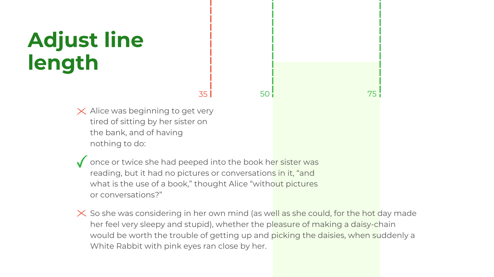
Pay attention to line length. Your reader’s eyes will get tired if you make them travel too far across the page, or move down too frequently. Give them a comfortable line length to experience – ideally somewhere between 50 and 75 characters. If the window they’re reading on may vary in width (eg. it’s for the web), you may need to set a max width on the content blocks with CSS, so that the line length will never exceed 75 characters.
5. Consider line height (or leading)
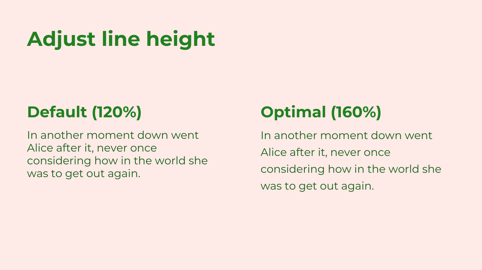
This is the vertical space between lines of text. Leading is the printing and graphic design term and line height is what it’s called in CSS. Adjusting leading is crucial for readability, especially for longer texts. The standard line height differs by browser but is about 110 to 120%. For long body copy it’s best practice to bump it up to somewhere around 160%.
Follow these tips, and you will be well on your way to communicating your message clearly and effectively!